


SIGN and HISTORY
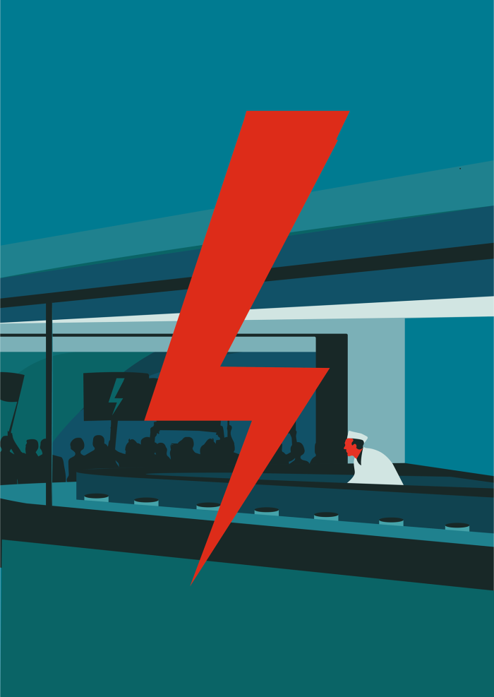
The lightning symbol appeared in the context of proabortion movement on 30 September 2016, when a newly created All-Poland Women’s Strike (hereinafter referred to as AWS) Facebook profile shared four graphic arts by Ola Jasionowska (fig. 1-4)[1].
il. 4
il. 3
il. 2

il. 1
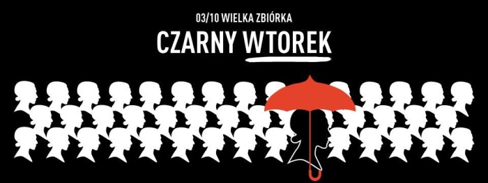
The main graphic’s direct impact (fig. 1), resulting from main motif’s multiplication, was weakened by narrational play of colour-changing lightnings. Out of the remaining three graphic arts, two included a lightning motif whereas one of them also alluded to an official AWS poster printed a few days before, announcing black protest on 3 of October 2016 (fig. 5)[2].
il. 8

il. 7

il. 6
il. 5
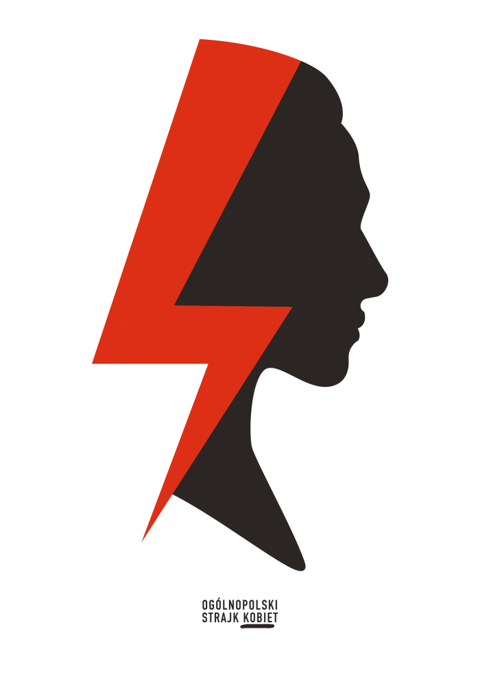
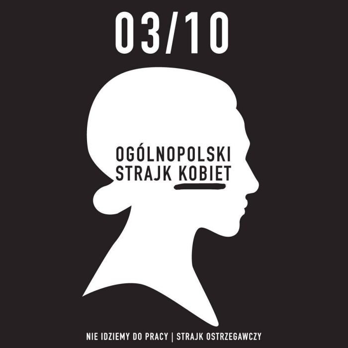
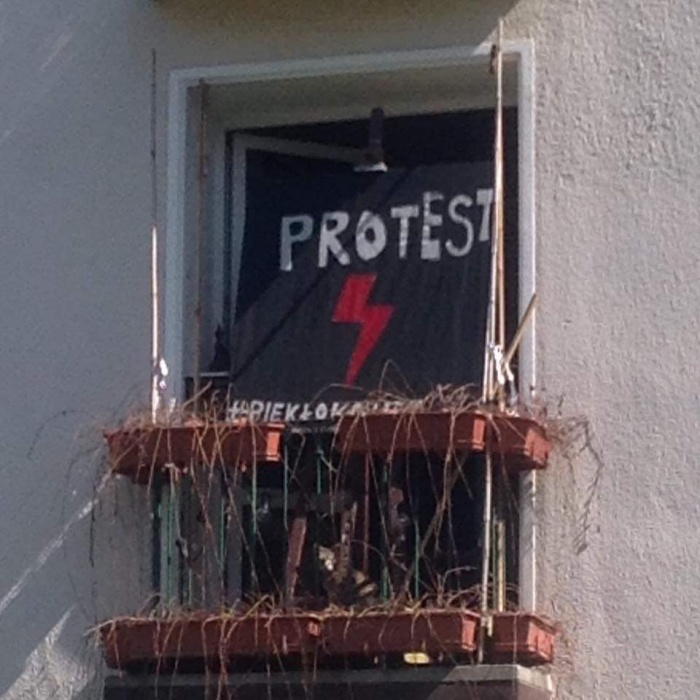
During the manifestation itself, however, these posters did not occur en masse, they were not a generally recognisable protests’ symbol. Yet, symbol of sorts – apart from ubiquitous black clothing of the crowd, makeup, handbags and other accessories – were the umbrellas[3]. Right after the protest, on 9 of October 2016, a new graphic art was published on the AWS Facebook profile (fig. 6), meant to be an identifying mark for AWS[4]. A red lightning, going directly cross-face through women’s head profile – an original portmanteau for previous motifs fully revealed its logotypical potential. From that moment on, it was continuously used for projects of posters to print and AWS internet messages[5]. Since autumn of 2016, the head motif (but not necessarily with the lightning) led an international life, being a subject to various alterations[6]. It was appreciated by The Association of Polish Graphic Designers that presented the author with Project of the Year award in Young Blood category for “All-Poland Women’s Strike poster from the previous year’s October, that made us realise what is graphic design in action”[7]. The award, according to the description and the illustration, did not concern mainly (or maybe – not above all else) the lightning logotype but it was rather the first head (fig. 5) that brought the attention as it was more open to filling and modifications. When on 3 of October 2017 – the black protest anniversary – the black Tuesday was organised, the main poster announcing that event had multiplicated head motif (without the lightning) integrated with the red umbrella motif (fig. 8)[8] while the crowd was dominated by umbrellas of different colours. For the following two years the lightning-head had been leading parallel life (being a subject to various colouristic metamorphoses[9]) with new posters (created without the head’s usage) that preannounce the upcoming AWS events. However, it was only insignificantly present in the demonstrating crowds. For instance, it can only be seen on two out of more than eighty pictures documenting the march from 8 of March 2018, on an online portal[10].
A significant, or as it transpired later – fateful, change came with protests of April 2020. Ola Jasionowska prepared two new “pandemic” heads this time (fig. 9 i 10)[11]; on one of the masks covering them (en face) a single lightning symbol was visible.
il. 9
il. 10
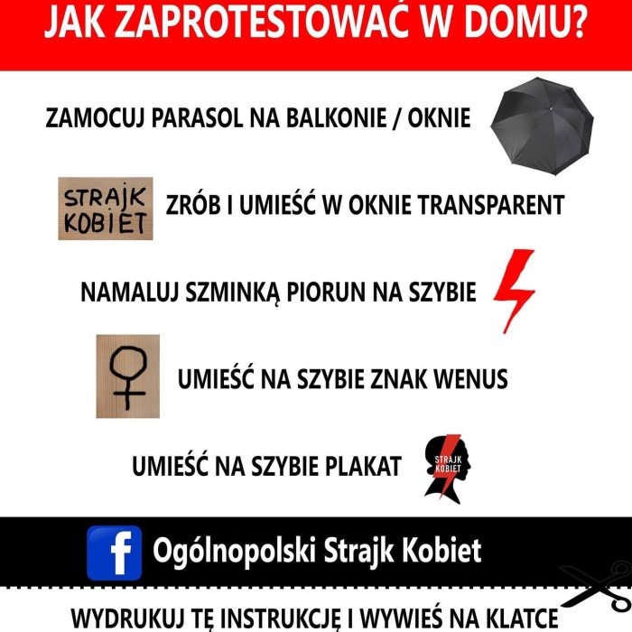
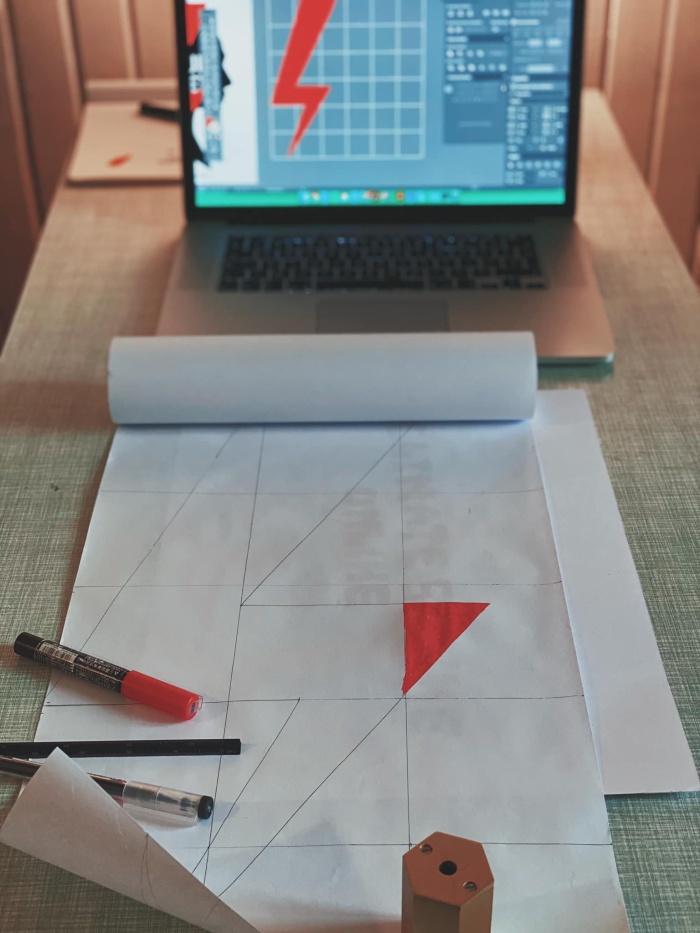
A few days after, on 14 of April 2020, the author posted on her Facebook a photo of her desk, captured while she was sketching a single lightning (fig. 11)[12]. Although April’s protests were limited in their scope in face of a total lockdown and their main activity shifted to the internet[13], they were a turning point for the lightning symbol independence. One of AWS instructions (fig.12) encouraged painting a lightning on a window with a lipstick[14]; social media were then brimming with photos of faces, hands and other parts of body painted with makeup this way. A single lightning (aka thunderbolt) has started its standalone life, though, a relatively limited one when considering public space. Nevertheless, the foundations were laid (fig. 13)[15]. At the end of October 2020, during anti-abortion protests outbreak, the single red lightning became the sole biggest visual beneficiary of their massive scale. Many graphic designers (including Ola Jasionowska herself – e.g. fig. 14[16]) have started creating (and have been doing so up to this day) more and more variations of the lightning in the lead role[17]. Yet these were not the elite-circulation artistic posters (though accessible as downloadable pdf files, ready to be printed and used in public space) but mass multiplication of independently rendered motif of a single lightning on diverse media by demonstrators decided upon its ubiquity in our visual culture’s “here and now”.
il. 14
il. 13
il. 12
il. 11
To conclude: the red lightning did not strike streets of Polish cities similarly to a bolt from the blue. However, the suddenness and the speed with which it spread at the end of last year’s October may appear it so. It emerged from one of those rather secluded realms that, until a certain moment (which may or may as well not come), do not constitute neither a subject of a particular interest nor a mass visual exploration.
SIGN and INTENTION
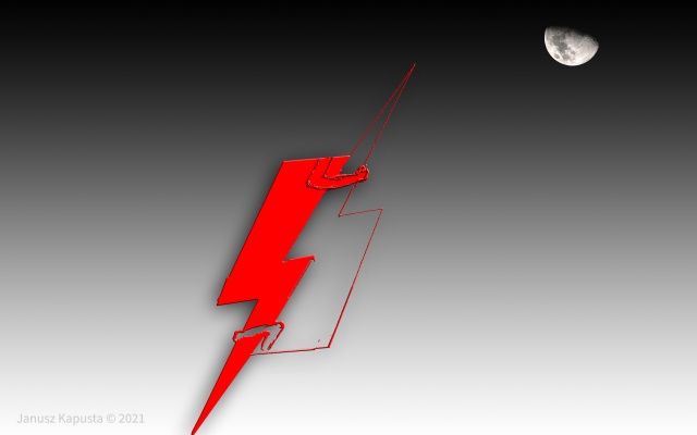
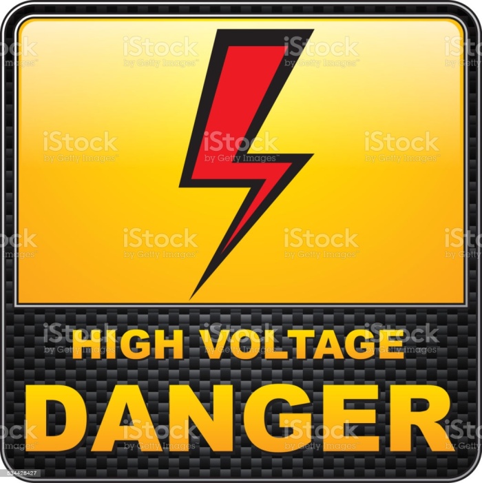
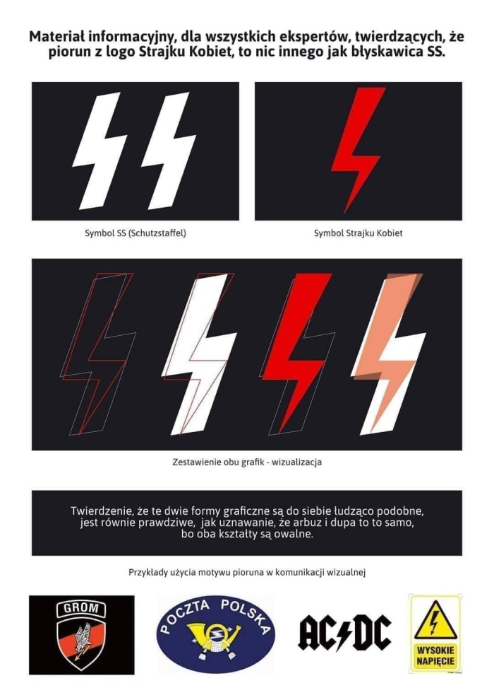
As much as we cannot avoid certain theoretical references in this text, I would like to ask a simple question about visual affinities of this particular lightning symbol, the subject of our consideration. Comparative visual analysis does not leave much doubt: its closest kin are to be found in the area populated by high voltage warning signs. Google Graphics offers a number of artifacts bearing much resemblance to our lightning – nevertheless, I was not able to find an identical one (and, being honest, I express my doubt that such a sign exists at all). On the basis of a not-so-strenuous query, I could indicate two signs (fig. 15 i 16) that, resulting from a compilation of some of their features (the shape of particular parts, their length, the angle and the colour), could together comprise our lightning’s image with high accuracy. The visual evidence speaks for the shape’s electrical and high-voltage visual origins.
il. 16
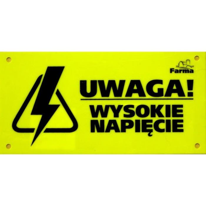
il. 15
And the intention? Again, trying not to get tangled in various theoretical differences concerning this term, I would like to pose a direct question about guided intentions of the artist, expressed in her own commentary. Asked by the journalist: Why the lightning? she replied: Its warning character is clear for all the people in the world, regardless of the country or the language they use. I have to admit, that when first posters for the Strike were made in 2016, I did not have the time to look for any elaborate meanings; there was no reference to mythology or religion, I referenced the warning sign alone as a strong graphic measure. A red lightning was supposed to contrast with a static profile of a woman that I painted on the poster. On the other hand, I wanted the poster not to be explicit, in no way referencing blood[18]. Author’s comment is in unison with visually-based evidence identification, it attests to the connection between our lightning and high voltage warning sign. However, it is an intentionally integral relationship: not merely formal but a semantical one as well. Asked for the meaning of the lightning, the artist states as follows: It says: beware, we warn you. We do not agree that basic women rights are taken away from them[19]. This time we came to know the intentional (author’s) meaning of the red lightning symbol. The artist consistently defends this meaning by invoking her intentions: In the case of our lightning, rightists’ allegations [that the lightning is connected with Nazi symbolism – author’s note] are absurd, that was not my idea[20]. Of course they were not, but… Is it not the example where an intentional (or “fontal”, as it is sometimes referred to) meaning lost its traditional status of the final instance in the methodological reflection area long ago? We shall return to this topic further on in the line of our discussion.
SIGN and RECEPTION I (SPRING 2020)
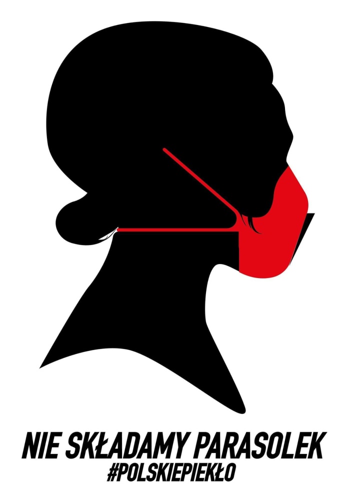
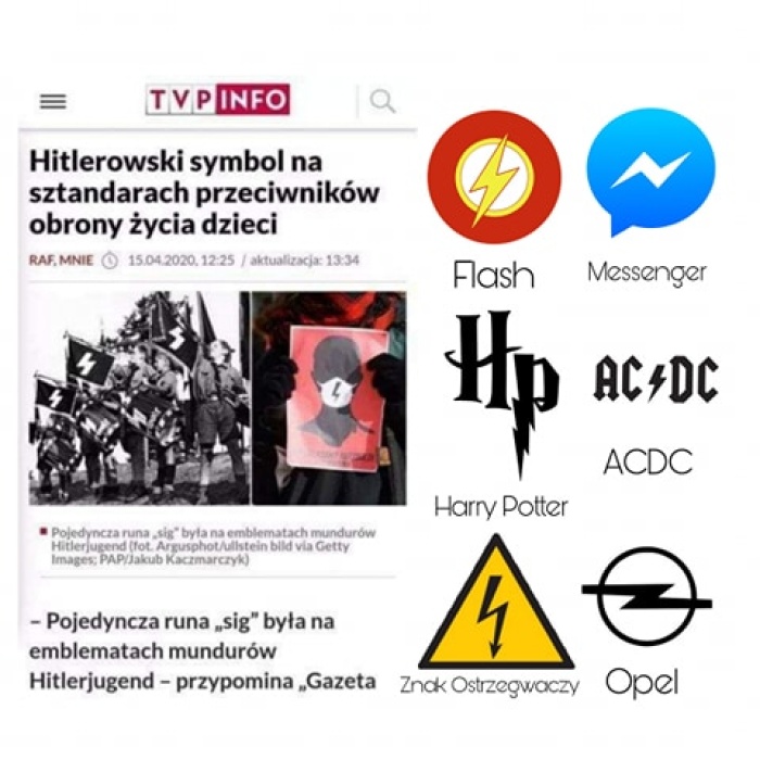
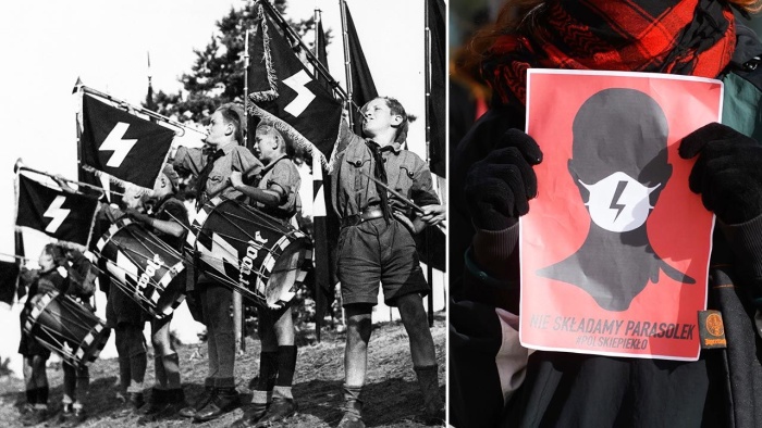
The lightning as a component of logotype head had avoided special attention for several days. It was not until April 2020, when it emerged as a single motif becoming an independent subject to the reception that was focused on it. This was initiated by sign’s subversive interpretation by pro-abortion movement opponents. In the text entitled “Hitlerian symbol on the standards of children life defence opponents” published on TVP INFO portal on 15 of April 2020, we read: A single “sig” rune was sewed on Hitlerjugend’s uniform insignia – as reminded by “Gazeta Wyborcza” in the text entitled “Ancient symbols in service of ideology. How totalitarian regimes distorted the meaning of runes and swastika”[21]. Now this Nazi symbol has been taken over by people affiliated with “Women Hell”. They oppose abortion regulations liberalisation ensuring legal life protection for children in mother’s womb, killed for being sick[22]. Apart from main illustration (fig. 17), the rest were screens of Twitter posts where such identification had occurred before. The reaction of pro-abortion side was swift. The following day brought: the interview with the author cited above in which she affirmed the absurdity of “rightists’ accusation”; a graphic on the AWS Facebook profile visually opposing its identification (fig. 18)[23], a heated discussion (254 comments) where debaters shared their conviction about the absurdity of comparing the AWS sign with that of Hitlerjugend’s; last but not least, an article published on a feministic portal by Katarzyna Chudzik entitled “What does a symbol of Women Strike lightning mean? »More like David Bowie than Hitler«”[24].
il. 18
il. 17
All three reactions had a common goal: to deprecate juxtaposing the AWS lightning with “Nazi rune”; though the emphasis they placed slightly differed. The pro-abortion society felt dangerous deconstructive potential for OSK symbol which resulted from a subversive reading of TVP INFO, based not only on the visual evidence but on a discursive one as well. The latter explicitly ascribed the rune – with a reference to not just any authority but “Gazeta Wyborcza” itself – a Nazi connotation. The artist, let us remember, invalidated the undesirable reading of her work on the grounds that it contradicted its intentional meaning assigned by the author. The very graphic (fig. 18) was to challenge such interpretation by illustrating diverse context for the lightning sign: the debaters indicated new contexts, not included in the graphic, such as lightning bolt of Polish Post and Grey Ranks Assault Groups or a red lightning on David Bowie’s face (as Ziggy Stardust). Multiplication of these juxtapositions to the extent that similarities with our lightning disappear testifies that visual comparative studies faded into the background. The argumentation was generally based on a unity of the sign in regard to a definition-symbol (“the lightning”) and not on a relationship of forms. This iconographic line of argument was developed in Katarzyna Chudzik’s text above where it was emphasised how historically and culturally ubiquitous the symbol of lightning is. We learn that starting from Zeus, then Perun and Thor and, eventually, Jahwe – the lightning bolt becomes a symbol of divine intervention, and, simultaneously, a symbol of a rapid change[25]. More recent references include the character of Janek Kupała who anticipated a revolution against tsarism, by writing: and the thunder will sound and move the entire world. Much as SS sign does originate from Viking runes, according to Janiszewska, however, it is not a symbol as unequivocally appropriated as swastika, a testament of which, presumably, is its commonness in contemporary visual culture. And that is precisely the area where proper references to out lightning are to be searched for. Chudzik believes that protesting youth feels that the closest association is the one of Harry Potter’s face scar, symbolising the victory resulting from the most powerful of all kinds of magic at work – love. And in the case of AWS protest, the author concludes, it is the love towards other women.
Despite the fact that autumn receptive controversies had a limited range and were short-lived, pro-abortion society managed to introduce to the general public some counterarguments with an intention of removing the odium of infamous Nazi symbolism from the lightning sign. And so, the argument of intentional meaning (which was not the intention of the artist) was linked to iconic profusion arguments (there is a great number of lightnings to which the AWS lightning can be compared) and symbolic profusion (the lightning might have a lot of various meanings). Those arguments were far from being coherent, a very transparent fact observed upon attempts to be used together (the case of Chudzik’s text). Their persuasive power was too weak to overrule once noticed similarity between a single AWS lightning and a single Hitlerjugen rune. Along with the overruling, the projection of Nazi ideas was to disappear and be substituted with “love towards other women” idea. The area of imagination and ideology created by such subversive reading still posed a threat to the integrity of our lightning.
SIGN and RECEPTION II (AUTUMN 2020)
This potential threat occurred in the material broadcasted in “TVP News” on 25 of October 2020, where similarities between both signs were recalled in the context of attacks on monuments and churches done by manifestants at that[26]. As reported the following day (26.10.2020) in a portal sympathetic to demonstrations, the internet users reaction was that of “laughter and outrage”: internet users immediately picked up the comparison and ridiculed it in social media. They saw a similar sign when telephone’s battery is charging or an energy symbol on a power distribution box [27]. This commentary tried to mock the comparison, most likely unaware of the gravity of threat and counter argumentation prepared in the spring. The following day (27.10.2020), another AWS-sympathising portal, made up for this shortage with substantial interest[28]. Monika Piorun, recalling principal topics present in as early as spring discussion, emphasised runic alphabet exegesis in particular[29], concluding that: Though the double “Sieg” rune (understood as twice used ᛋᛋ symbol) were used by SS troops and a single ᛋ sign was used for marking youngsters of Hitlerjugend, in both cases there was no reference to any lightning or lightning bolts whatsoever [original underlined]. What is relevant here, is that Piorun did not stop her line of argument with symbolic profusion phenomena but by proving lack of any significant resemblance of the rune and the lightning, she tried to negate the meaningfulness of their comparison. On that very day (27.10.2020), a graphic going in the same direction appeared on the internet (fig. 19)[30]. Nevertheless, Piorun’s elaborate discourse was substituted with visual evidence and lack of significant resemblance did not involve the idea rooted in history but something more primary – the form. It constituted a relevant novum when considering current, both discursive and visual (iconic profusion), argumentation. The graphic waged a war against the thesis of similarity between the two signs by operating not in the discursive but within visual area of original recognition. A visual comparative analysis, showing apparent formal incompatibility, was to negate the meaningfulness of their visual comparison once and for all. AWS supporters of abortion accepted such explanation in this very spirit. Although, it did not influence their opponents in the slightest.
il. 19
The real reception hell broke loose after a comment made by marshal Ryszard Terlecki (27.10.2020): I regret to say that among deputies of the Left and Civic Platform we also have representatives with signs bearing a striking resemblance to Hitlerjugend and SS symbols. Yet I understand, that the total oppositions refers to totalitarian fashion and we accept that with due resentment[31]. This resonated in unison with media statement made by archbishop Marek Jędraszewski (26.10.2020), where hierarch claimed that the sign of lightning was also used by SS men[32]. These comments were greeted by a violent reaction from – in broader terms – the other side. A representative of such reactions might be exemplified by the text entitled “Women Strike has an SS symbol? Terlecki and Jędraszewski’s rubbish, confusing Nazis with Grey Ranks”[33]. A keyword here is “rubbish”. It is a harbinger to the text’s narration (I shall skip this part without regret) revealing main premise of the argumentation. If rubbish (premise) is truly it, then a question arises: why do Jędraszewski and Terlecki automatically associate protest symbol with Nazis and not groups of young people fighting the occupant [meaning Grey Ranks – author’s note]. It may be malice, malevolence, lack of knowledge on the topic but also a political agenda based on manipulation. The core of this manipulation is, according to the author, anti-German sentiment. Now, the story of Law and Justice states that hundreds thousands people protesting in whole Poland under the banner of Women Strike are lefty extremists representing anti-fascism movements using Nazi symbols. Thus, manipulation, malevolence, malice or lack of knowledge … Or maybe a case of using the right for intertextual reading?
SIGN and SPECTATOR’S “SURPRISED EYE”
As I promised before, we are not going to avoid certain theoretical references[34]. What is intertextualism? It is a theory of culture texts (including paintings) reading in which a crucial role in generating texts’ meanings is played by associations between words established by the recipient. In the intertextual perspective, the intentional meaning of the text (author’s “source meaning”) is not distinguished in respect to other possible meanings created in the process of perception that occurs in historically (subjectively) conditioned visual area (in order to focus on media based on images). The images familiar to the observing subject (that includes both an artist and a viewer in equal measure) infiltrate, using visual similarity, a creation/reception process and their realisation in a creation/reception process leaves a visual trace, brimming with the meaning/meanings from previous contexts. For instance: Mieke Bal noticed a similarity between the posture and gestures made by one of the old men in “Susanna and Elderly” painting by Rembrandt and the posture and gestures from copperplate engraving “Melencolia” by Dürer. The melancholic gesture of the old man, made during the act of removing woman’s robe, exhibits his reflection on his upcoming violation of the law that can explain viewer’s emerging feeling that old man’s activity appears frozen. The feeling, we must add, irresistible right now, directly after Bal’s subversive interpretation. A relation once seen with a viewer’s (Bal’s) “surprised eye” cannot be unseen and the meaning evoked by it – forgotten.
Analogically, our lightning is such case as well, although, to simplify matters a bit, we are down to a lower level of significance: from a text to a sign. However, the principle remains the same. The lightning is not ruled by an everlasting principle of signifier (material media) and the signified (a definition). It is a flexible signifier, ready to be linked to a wide range of culturally conditioned signified entities, both connotative (e.g. primal force of nature, divinity, fall, sudden change, speed, warning, victory etc.) as well as denotative – (e.g. “danger, high voltage”, “charging”, Ziggy Stardust, Harry Potter, Polish Post, AWS etc.). One of the directives of intertextual reading (placing a dam for anything goes practice) is the visual similarity between texts (signs). In our case, the signs in play are primarily signs of a single lightning having a form similar to the AWS lightning (similar only to this specific extent – no more and no less than that; the identicalness in intertextual relations is a border phenomenon). The subversive reading of the AWS lightning, whose form is closer to the rune’s more than any other lightnings’ forms, satisfies the condition of similarity. Noticing the rune sign functioning in the Third Reich as the AWS lightning sign means therefore, accordingly to the intertextual relation, realisation of the latter’s (specifically and not any other) meaning of the rune as the Nazi victory sign. On the one hand, there are opponents of abortion, for whom the highest value is natural dignity of every human life, an imperative of which being in effect since the conception until one’s natural death. On the other hand, pro-abortion movement, assuming human life’s quality as the most important value, propagating not only abortion on demand but also, consistently, euthanasia and global demographic control. Can these slogans, eugenic in their very essence, be associated with eugenic ideological terms and Nazi practice by opponents of abortion? By all means, they can.
To conclude: subversive interpretation of the lightning sign results from totally correct (one of many possible) intertextual reading. There is no way in which referring to the “original” (author’s) meaning; or indicating iconic and symbolic profusion phenomena; or argumentation within the idea’s history scope; or, finally, illustrating non-identicalness of both signs’ forms – none of these arguments cannot challenge the validity of well-established theory and flawlessly performed intertextual reading of the AWS lightning. The interpretation made by abortion opponents had a “chilling” effect (cf. Bal) on revolutionary-progressive inclinations of the red (though it is black at times) lightning, taking it down to the dark Nazi realm. And what about the future? This is always for the context of a given text (resp. a sign) to decide. In our case, the context being contemporary Polish political practice. The bigger the AWS’s ideological radicalisation the more aggressive the language of communication between activists and the society and – in consequence – the higher the number of people willing to use the term “new barbarity”, the stronger the foundation for subversive reading of the AWS sign and a simultaneous reference to the “old barbarity”. Given this, is our lightning going to share the same fate as swastika sign, completely banned from public space? I do not think so. It is protected, to put it briefly, by its red colour. For the opponents of abortion, this colour enhances yet another intertextual interpretation, this time through reference to communist totalitarianism. Nevertheless, such an obvious reference did not do any harm to five-pointed star or hammer and sickle sign. It will not harm the lightning itself; quite on the contrary: it can feel entirely safe inside the heavily fortified, potent camp of unrelenting progress.
SIGN and HYPOGRAMMATICAL SIGNATURE
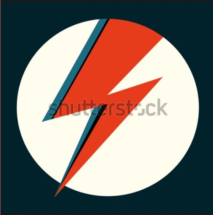
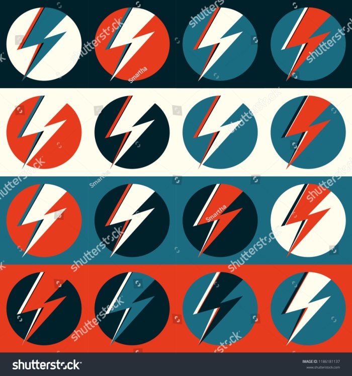
Finally, let us return to the beginning, remaining within the semiotic theoretical reference area. The term in the title was borrowed from Louis Marin, who, in his canonical text about Nicolas Poussin painting, The Arcadian Shepherds, described this way the letter “r” found in “Et in Arcadia ego” inscription engraved on a tombstone. According to Marin, “r” (“clear meaningful”) is the initial letter of cardinal Rospigliosi’s name, a person who coined the engraved phrase as well as commissioned the painting. In other words, “r” is a kind of hypogrammatical (below the level of grammar) signature of author’s family name, both the sententia and the painting itself. Maybe on the lowest, sub-code level of pure form, the red lightning will reveal its hypogrammatical signature potential? Let us quote a fragment of Ola Jasionowska’s self-commentary: I referenced the warning sign alone as a strong graphic measure. A red lightning was supposed to contrast with a static profile of a woman that I painted on the poster. Previously, our attention was pointed towards to the warning sign which led us directly to lightning and electrical analogies. We skipped the following, strictly formal, reference that the author tried to solve. A “strong graphic measure”, a “contrast with a static profile” – these descriptions direct us, at least I was directed, to stock visual artifacts signed by “Smartha” nick. Let us then compare our “lightning head” (fig. 6) with one of Smartha’s pictures (fig. 20)[35].
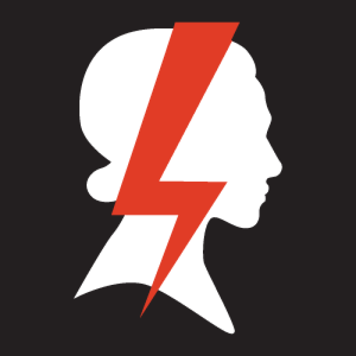
il. 6
il. 20
Or let us correlate another work (fig. 21) with our “original work” (fig. 1)[36]. To humorously twist a well-known slogan: “yes, that would be it!”.
il. 21
il. 1
English translation by J. Bujno.
[1] See https://www.facebook.com/ogolnopolskistrajkkobiet/posts/1544723052220354 (access 15.01.2021); the given access date applies to all referred websites in this text.
[2] This poster, made by Ola Jasionowska, appeared on AWS Facebook profile on 26 of September, 2016 (see https://www.facebook.com/ogolnopolskistrajkkobiet/photos/a.1539770372715622/1539770416048951 ).
[3] It was the weather that, somewhat coincidentally, decided on this; cf. https://obieg.u-jazdowski.pl/numery/polskosc/we-will-not-fold-we-will-not-fold-our-umbrellas-pl.
[4] It was published in two formats (jpg i png) as a small-resolution image (see https://www.facebook.com/ogolnopolskistrajkkobiet/photos/1556475671045092; https://www.facebook.com/ogolnopolskistrajkkobiet/photos/1556479291044730).
[5] For the first time as part of the protest on 24 of October, under a banner of “We do not fold umbrellas” (see https://www.facebook.com/ogolnopolskistrajkkobiet/photos/1558254640867195). That was when the poster with a red umbrella (il. 7) motif of the same authorship was created (see https://www.facebook.com/oooolajasionowska/photos/799250480217743).
[6] See post from 20 of January 2017 (https://www.facebook.com/ogolnopolskistrajkkobiet/posts/1742946645731326); cf. also: https://www.wysokieobcasy.pl/wysokie-obcasy/7,115167,21461279,autorka-plakatu-ktory-kopiuja-feministki-na-calym-swiecie.html?disableRedirects=true.
[7] See https://www.facebook.com/wwwSTGUpl/posts/1942258182458738; cf. also: https://www.facebook.com/ogolnopolskistrajkkobiet/posts/2207982125894440.
[8] The poster was designed by Ola Jasionowska and Adriana Tronina; see https://www.facebook.com/ogolnopolskistrajkkobiet/photos/a.1539771202715539/2087633527929301.
[9] See e.g. four versions at BWA Studio exhibition in Wrocław (https://www.facebook.com/ogolnopolskistrajkkobiet/photos/3502869143072392).
[10] See https://business.facebook.com/pg/PUNKPARROTstore/photos/.
[11] See https://www.facebook.com/oooolajasionowska/photos/1708843185925130; https://www.facebook.com/ogolnopolskistrajkkobiet/photos/4344640082228623.
[12] See https://www.facebook.com/oooolajasionowska/photos/1713694752106640. As commented by the artists herself in an interview for “Newsweek”: “The lightning hangs in the living room and on the windows. I didn’t have a printed poster, I had to sketch it on a technical grid” (https://www.newsweek.pl/polska/ogolnopolski-strajk-kobiet-autorka-blyskawicy/ph9d2xk).
[13] The observation is credited to Mrs Gabriela Skrzypczak, the author of the latest presentation “AWS visuals during coronavirus pandemic” showed in May 2020, as part of Modern Visual Culture activities at History of Art Institute in the Adam Mickiewicz University.
[14] See https://www.facebook.com/ogolnopolskistrajkkobiet/photos/4357332874292677.
[15] A photograph taken on 13 of April 2020; see https://www.facebook.com/ogolnopolskistrajkkobiet/photos/4361405930552038.
[16] See https://www.facebook.com/oooolajasionowska/photos/1893058534170260.
[17] See especially: https://pogotowie.tumblr.com.
[18] The interview published on 16 of April 2020 (https://www.newsweek.pl/polska/ogolnopolski-strajk-kobiet-autorka-blyskawicy/ph9d2xk.
[19] Ibidem.
[20] Ibidem.
[21] The article written by Joanna Grabowska, released on 27 of September 2019; see https://wyborcza.pl/7,75400,25235082,starozytne-symbole-w-sluzbie-ideologii-jak-totalitaryzmy-wypaczyly.html.
[22] https://www.tvp.info/47576378/pieklo-kobiet-hitlerowski-symbol-na-sztandarach-przeciwnikow-obrony-zycia-dzieci-wieszwiecej.
[23] See https://www.facebook.com/ogolnopolskistrajkkobiet/photos/a.1540520529307273/4371035676255730.
[24] See https://www.ofeminin.pl/swiat-kobiet/to-dla-nas-wazne/jaki-jest-symbol-strajku-kobiet-i-co-oznacza-blyskawica/4k1hjce.
[25] The author recalls Aleksandra Janiszewska, an art historian, statements here.
[26] See https://wiadomosci.tvp.pl/50495721/atak-na-kosciol.
[27] https://www.o2.pl/informacje/smiech-i-oburzenie-po-materiale-tvp-zobacz-z-czym-skojarzono-protesty-kobiet-6568833322306304a.
[28] See M. Piorun, Oburzone Polki zagrzmiały piorunami. Co symbolizuje czerwona błyskawica podczas Strajku Kobiet 2020? (https://natemat.pl/324721,symbol-czerwonej-blyskawicy-co-oznacza-czerwony-piorun-na-strajku-kobiet).
[29] To clarify: even in April Facebook debaters claimed, that the rune is not an explicit Nazi symbol, yet, it was not an exposed topic; see https://www.facebook.com/ogolnopolskistrajkkobiet/photos/a.1540520529307273/4371035676255730.
[30] On the Facebook of regional AWS units and associated organisations, among others (see e.g. https://www.facebook.com/elblaskistrajkkobiet/photos/111660787397471; https://www.facebook.com/wroclawdlademokracji/photos/3701552293223444).
[31] See https://www.polskieradio24.pl/5/1222/Artykul/2609286,Terlecki-poslowie-Lewicy-i-PO-maja-maseczki-ze-znakami-przypominajacymi-symbole-Hitlerjugend.
[32] See https://www.rp.pl/Spor-o-aborcje/201029472-Abp-Jedraszewski-Trzeba-ratowac-zdrowa-tkanke-narodu.html.
[33] See https://oko.press/strajk-kobiet-ma-znak-ss-brednie-terleckiego-i-jedraszewskiego/. Author: Michał Danielewski; date of publication: 27.10.2020.
[34] On the subject of intertextualism see especially works of Mieke Bal i Stanisław Czekalski. The term “confused eye” was taken from Victor Stoichita.
[35] Podpis głosi: „David Bowie Ziggy Stardust czerwony błysk. Ręcznie rysowana ilustracja wektorowa z błyskawicą w kółko do logo, plakatu, pocztówki, nadruku odzieży, ulotki. Retro znak izolowany czerwony piorun na jasnym tle” (zobacz https://www.shutterstock.com/pl/image-vector/david-bowie-ziggy-stardust-red-flash-1057405478).
[36] The caption says: „Flash vector. Lightning pop art illustration. Flat flash in circle for logo, poster, postcard, clothing print, flyer. Retro sign with isolated thunderbolt in pop art style. Red, blue and white logo” (see https://www.shutterstock.com/pl/image-vector/flash-vector-lightning-pop-art-illustration-1186181137).